Build Your First Responsive Web Page with HTML & CSS (Zero to Deployed)
We build one small real page: a cafe menu called “Chai & Code Cafe”.
You need only two files: index.html for structure and style.css for looks.
Every screenshot in this guide is from a real screen, including the ugly first version.
By the end, your page will be live on the internet with a free URL you can share.
No prior coding experience needed. If you can save a file, you can finish this guide.
Team note: We built this exact page ourselves before writing this guide, and we broke it three times on the way. Once by forgetting to save. Once by naming the file Style.CSS with capital letters, because the internet cares about capital letters. And once by missing one semicolon. If your page ever looks wrong, it is usually one of these three things.
What We Are Building Today
Today we build a small menu page for an imaginary cafe called Chai & Code Cafe. It has a banner, three menu cards, and a footer. Small on purpose, because a small finished page teaches more than a big abandoned one.
By the end of this guide you will have done four real things:
Written an HTML page from an empty file
Styled it with CSS so it looks clean
Made it responsive so it works on phones
Deployed it free, with a live URL you can open on your phone
That last point matters. A page on your laptop is a practice page. A page on the internet is a project you can put in a resume.
Step 1: Setup — One Folder, Two Files
Install VS Code (free) if you have not already. Then create a folder on your Desktop named chai-cafe, and open that folder in VS Code using File → Open Folder.
Inside the folder, create exactly two files:
File | Job |
index.html | The skeleton: headings, text, cards, footer |
style.css | The paint: colors, spacing, sizes, layout |
Keep the names exactly like this, all lowercase. The file index.html is special: hosting services look for this name first when someone opens your site.
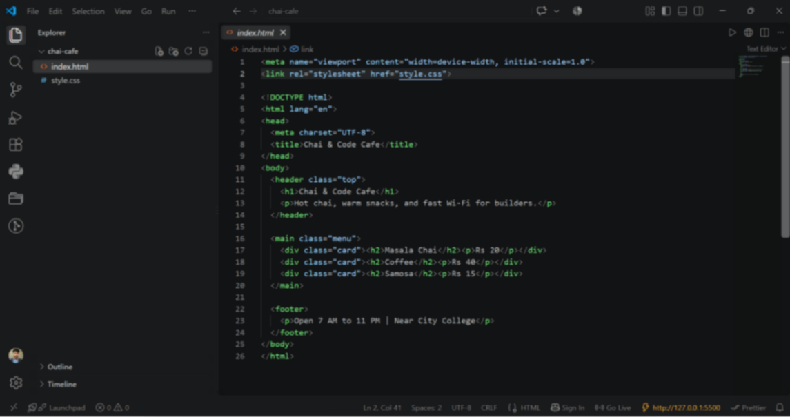
Step 2: The HTML Skeleton
HTML is not programming. It is labeling. You tell the browser: “this is a heading”, “this is a paragraph”, “this is a card”. The browser then draws those labels.
Copy this into index.html exactly as it is:
<!DOCTYPE html>
<html lang="en">
<head>
  <meta charset="UTF-8">
  <title>Chai & Code Cafe</title>
</head>
<body>
  <header class="top">
    <h1>Chai & Code Cafe</h1>
    <p>Hot chai, warm snacks, and fast Wi-Fi for builders.</p>
  </header>

  <main class="menu">
    <div class="card"><h2>Masala Chai</h2><p>Rs 20</p></div>
    <div class="card"><h2>Coffee</h2><p>Rs 40</p></div>
    <div class="card"><h2>Samosa</h2><p>Rs 15</p></div>
  </main>

  <footer>
    <p>Open 7 AM to 11 PM | Near City College</p>
  </footer>
</body>
</html>
Now understand each part in plain words, so you are not copying blindly:
<!DOCTYPE html> — tells the browser “this is a modern HTML page”.
<head> — the behind-the-scenes area: title, character settings, and later the CSS link.
<title> — the text shown in the browser tab.
<body> — everything the visitor actually sees.
class="card" — a name tag, so CSS can style all three cards at once.
Step 3: First Look — And Why It Looks Ugly
Save the file with Ctrl + S. Then in VS Code, right-click on index.html and choose “Open with Live Server”, or simply drag the file into Chrome.
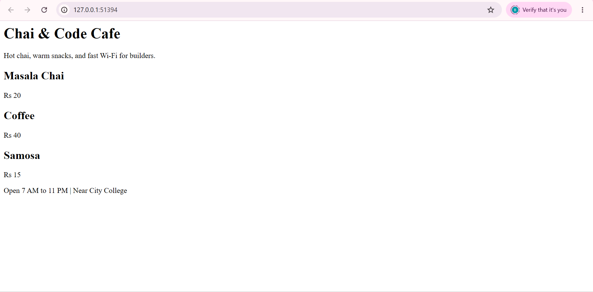
Yes. It looks plain. Black text on white, everything stacked like a list. And that is completely correct.
Do not panic here: this is the browser’s default style. We have not attached any CSS yet, so the browser is showing raw structure. Ugly now means the CSS step will feel like magic.
Step 4: Attach CSS — The First Coat of Paint
First, connect the CSS file. In index.html, inside the <head> section, add these two lines:
<meta name="viewport" content="width=device-width, initial-scale=1.0">
<link rel="stylesheet" href="style.css">
The first line is the viewport meta tag. Without it, phones pretend to be wide desktop screens and shrink your page. Every beginner forgets this line once. Now you will not.
The second line attaches your stylesheet. If the file name does not match exactly, nothing will style. This is where the capital-letters mistake hurts.
Now open style.css and paste this base style:
* { margin: 0; padding: 0; box-sizing: border-box; }

body {
  font-family: Arial, Helvetica, sans-serif;
  background: #fff8f0;
  color: #333;
}

.top {
  background: #b3541e;
  color: #fff;
  text-align: center;
  padding: 40px 16px;
}

.menu {
  display: flex;
  gap: 16px;
  padding: 24px;
  justify-content: center;
  flex-wrap: wrap;
}

.card {
  background: #fff;
  border: 1px solid #eadfce;
  border-radius: 10px;
  padding: 20px;
  width: 180px;
  text-align: center;
  box-shadow: 0 2px 6px rgba(0,0,0,0.08);
}

footer {
  text-align: center;
  padding: 16px;
  color: #777;
}
Save both files and refresh the browser. Here is what each rule is doing, in friendly words:
* reset — removes the browser’s default gaps so we control spacing ourselves.
body — sets a warm cream background and a readable font.
.top — turns the header into a chai-colored banner with white centered text.
.menu with display: flex — places the three cards in a row instead of a stack.
.card — gives each item a white box, soft border, rounded corners, and a light shadow.
footer — quiet gray text, centered, with breathing room.
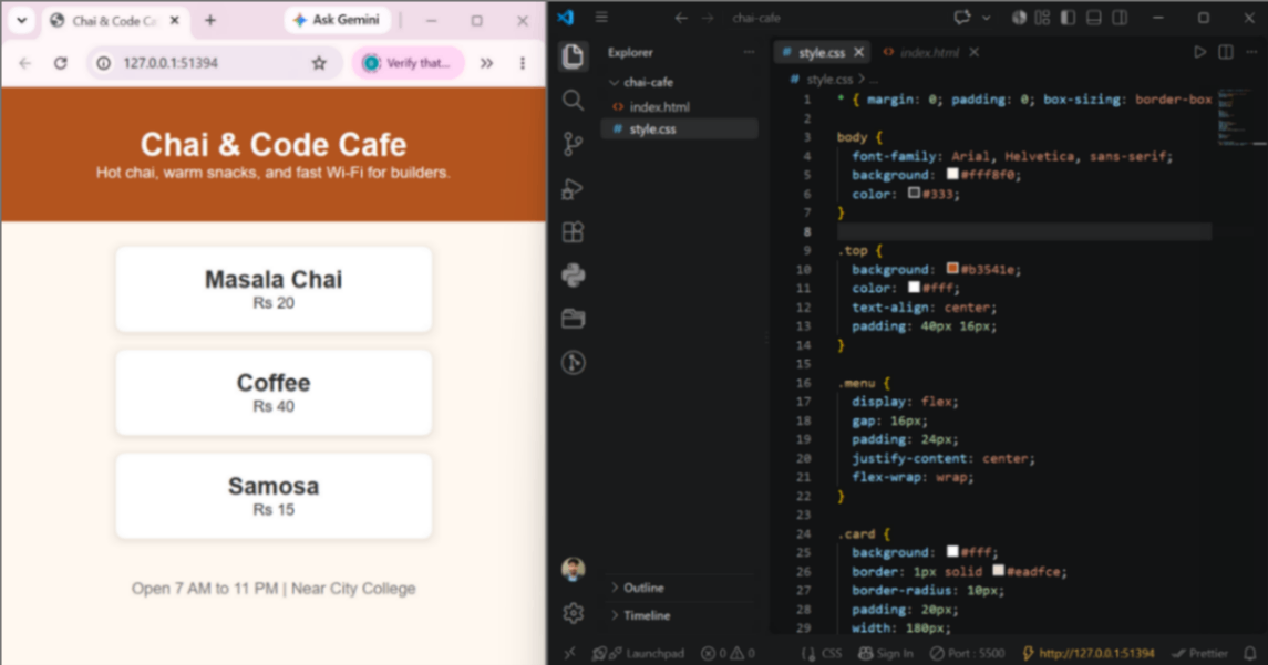
Look at the difference between this and the ugly version. Same HTML, zero changes there. Only CSS changed. That is the moment most beginners fall in love with web development.
Habit to build now: press Ctrl + S every few minutes. Half of all “my code is not working” problems in the world are simply unsaved files. We have been there too.
One thing is still missing: the page looks great on desktop, but we have not checked a phone yet. That is exactly what the next step fixes, with the one CSS block every responsive page needs.
Step 5: The One CSS Block That Makes It Mobile-Friendly
Right now our page looks good on a desktop. But most real visitors will open it on a phone. So before we celebrate, we need one small CSS block called a media query.
A media query is just an “if” sentence for screen sizes. It says: if the screen is 600px wide or smaller, use these rules instead.
Add this at the very bottom of style.css:
@media (max-width: 600px) {
  .menu { flex-direction: column; align-items: center; }
  .card { width: 100%; max-width: 320px; }
}
Now understand it line by line, in plain words:
@media (max-width: 600px) — “when the screen is 600px or smaller, do the things inside these brackets.”
flex-direction: column — stop placing cards side by side; stack them one below another.
align-items: center — keep the stacked cards neatly in the middle.
width: 100% with max-width: 320px — let each card fill the phone width, but never grow huge on tablets.
Save the file. Nothing will change on your desktop screen, and that is correct — this block only wakes up on small screens.
Team note: This is the exact moment responsive design clicked for us. One small “if” sentence, and the same page behaves differently on every screen. No separate mobile site needed.
Step 6: Check It Like a Pro — Device Mode
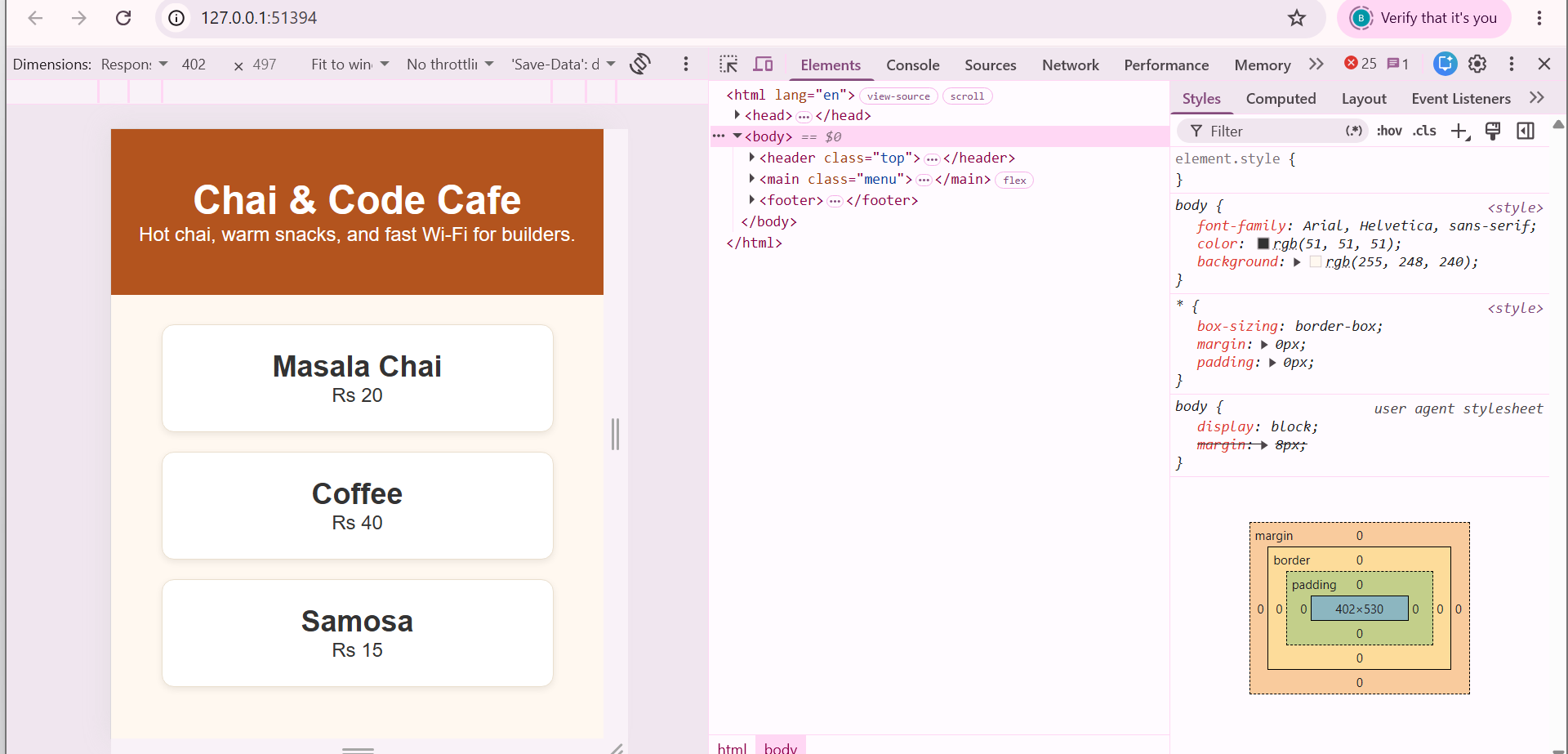
You do not need a real phone to test this. Chrome has a built-in phone simulator called device mode. Here is how to open it:
Press F12 to open DevTools
Press Ctrl + Shift + M to switch to device mode
Pick any phone from the dropdown at the top, like iPhone or Galaxy
Refresh the page with F5
Your cards should now stack neatly, one below another, filling the phone width nicely.
Step 7: Break It On Purpose (Yes, Really)
Here is a learning trick we use with every beginner: break your own page on purpose, see the damage, then fix it. You will never forget the rule again.
Break it:
In style.css, select the whole media query block you just added
Press Ctrl + / to comment it out (it turns gray)
Save with Ctrl + S and refresh the phone view
Look at the cards now. They shrink back to narrow boxes, uneven and cramped, like guests who forgot to sit properly. This is what a page looks like without mobile rules.
Fix it: select those gray lines again, press Ctrl + / once more to uncomment, save, refresh. The cards sit neatly again.
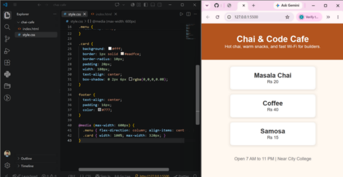
That before-and-after pair is worth more than ten theory pages. You have now seen, with your own eyes, exactly what one media query does.
Chai break rule: after every step — save, refresh, look. We still follow this habit on every project, even today. Skipping the “look” part is how bugs hide.
6 Beginner Mistakes That Break Layouts
These are the six mistakes we see most often, including the ones we made ourselves while building this exact page.
Mistake | What You See | Fix |
Forgetting the viewport meta tag | Phone shows a tiny zoomed-out page | Add the viewport line in head |
File name capital letters, like Style.CSS | CSS never loads, page stays ugly | Keep names lowercase: style.css |
Not saving the file | “My code is not working!” but it never ran | Ctrl + S before every refresh |
Missing closing bracket in CSS | Rules after the mistake stop working | Count your { } pairs |
Fixed widths like width: 900px | Horizontal scrolling on phones | Use % and max-width instead |
Testing only on desktop | Page breaks on real users’ phones | Open device mode every time |
If your page ever misbehaves in future projects, check this table first. Nine out of ten times, the bug is sitting in one of these six rows.
Honest moment: during our own build of this page, we missed a closing bracket and spent fifteen minutes blaming the browser. The browser was fine. It is usually fine. Check your brackets before you blame anything else.
Your page is now structured, styled, and responsive. Only one magical step remains: taking it from your laptop to the internet, so anyone with the link can open it. That is the deploy step, and it is easier than everything you have done so far.
Step 8: Put Your Code on GitHub
Right now your project lives only on your laptop. If your laptop dies tomorrow, your first website dies with it. GitHub fixes that, and it also becomes your public portfolio over time.
Follow these clicks slowly, exactly in this order:
Go to github.com and click New repository
Name it chai-cafe, keep it Public, and leave all checkboxes unchecked
Click the green Create repository button
On the next screen, click the link that says uploading an existing file
Drag both files, index.html and style.css, into the box
Write a commit message like “add my first web page” and click Commit changes
A commit is just a saved moment of your project, like a checkpoint in a game. You can always come back to it.
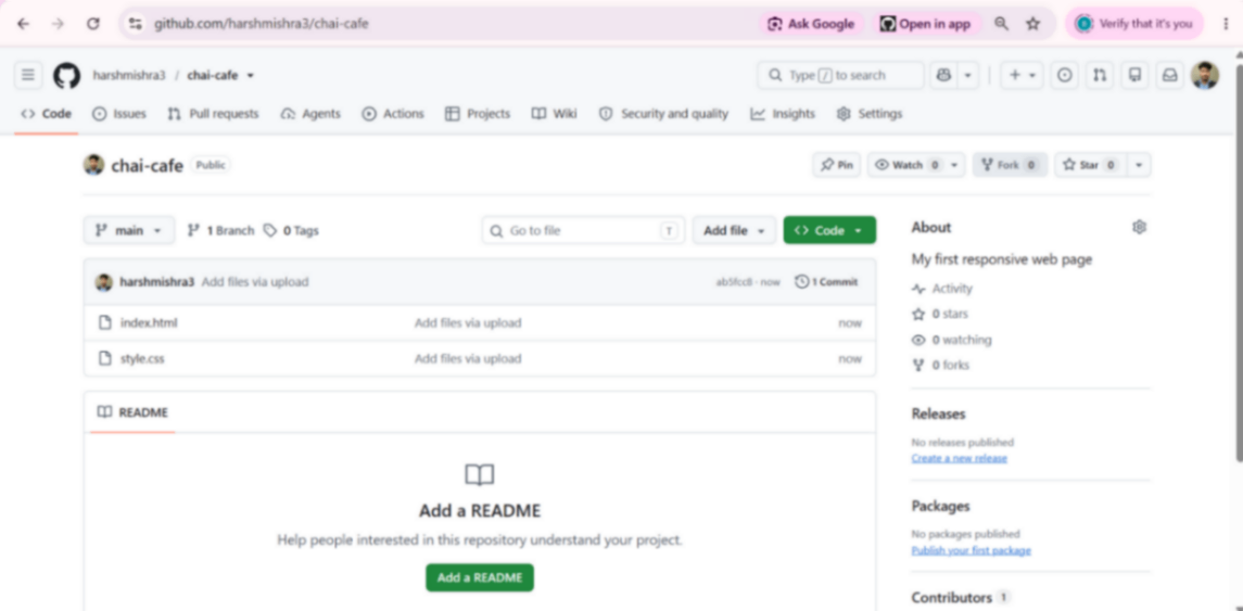
Team note: Our first commit message was literally “test”. It is still there in an old repository, and we are not ashamed. Ugly beginnings are part of the craft.
Step 9: Deploy Free on Netlify
Now the magical part. Netlify will take your GitHub files and turn them into a real website with a public URL. Free, forever, for small sites like this.
Go to app.netlify.com and sign in with your GitHub account
Click Add new site → Import an existing project and choose GitHub
Pick the chai-cafe repository from the list
Leave all settings empty. Netlify already knows that index.html means “start here”
Click the big Deploy chai-cafe button
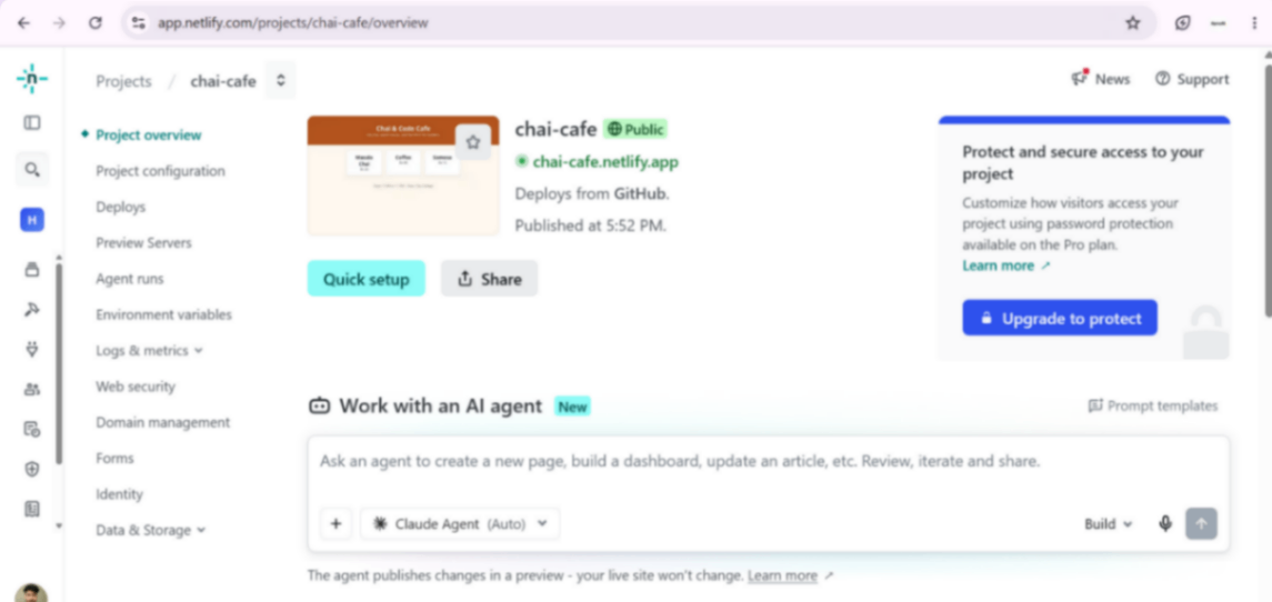
Wait around ten seconds. You will see a status change from building to published, and a green URL appear, something like chai-cafe.netlify.app.
That URL is yours. Anyone in the world, on any phone, on any network, can now open a page that you typed from an empty folder.
Bonus superpower: from now on, every time you edit a file and commit it on GitHub, Netlify automatically redeploys your site. You just changed your website like a real developer, without uploading anything manually.
Step 10: The Phone Moment
Do not skip this step. It is the most important one in the entire guide.
Copy your live URL
Send it to yourself on WhatsApp, or type it in your phone browser
Open it. Scroll it. Watch the cards stack exactly the way you taught them to
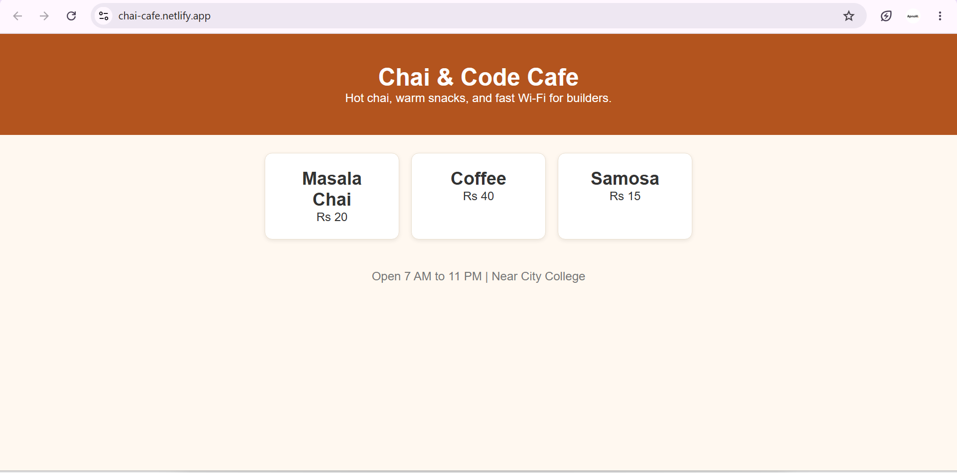
We still remember the first time a page we typed opened on our own phone. We showed it to three people who had not even asked. That feeling is not hype. It is proof that you can build and ship something real.
A website is not magic. It is files, a folder, and the courage to press deploy.
What to Build Next
Do not stop at one page. Momentum is your best teacher right now. Here is a natural ladder, each step adding exactly one new skill:
Add Images
Real cafe photos with the img tag.
Contact Form
Netlify Forms, no backend needed.
Dark Mode
CSS variables plus a toggle button.
Second Page
menu.html linked from home.
Custom Domain
Your own name in the URL.
Each of these is a small weekend project. And every one of them makes your GitHub profile look like a builder’s profile, not a student’s profile.
A website is just files in a folder. index.html is the front door.
HTML is the skeleton, CSS is the paint, and media queries are manners for phones.
The viewport meta tag is the line every beginner forgets once. You will not forget it twice.
Chrome DevTools device mode is a free phone laboratory. Use it on every project.
Breaking your page on purpose teaches you faster than reading ten tutorials.
GitHub keeps your code safe and becomes your public portfolio.
Netlify turns a repository into a live URL for free, and redeploys on every commit.
Save, refresh, look. This three-word habit prevents most beginner bugs.
Conclusion
Look back at where you started: an empty folder and two blank files. Look at where you are now: a structured page, a styled page, a responsive page, and a live URL that works on your phone.
That journey is exactly what web development is. Not magic, not talent, not a perfect course. Just small honest steps: write a little, look at it, fix a little, ship it.
If this guide felt easy to follow, that was the point. We wrote it the way we wish someone had written it for us: with real screenshots, real mistakes, and no pretending that everything works on the first try.
Now go build the next thing. Add images. Add a form. Add a second page. And when someone asks “have you ever made a website?”, you get to say yes, and send them the link.
The internet is not made of magic. It is made of files like yours, uploaded by people who decided to start.
Thank you for building with us. If this guide helped you ship your first page, share your live URL in the comments or with a friend who is still “planning to start”. Sometimes one link is all the push someone needs. — Harsh Mishra, APNOAI Team